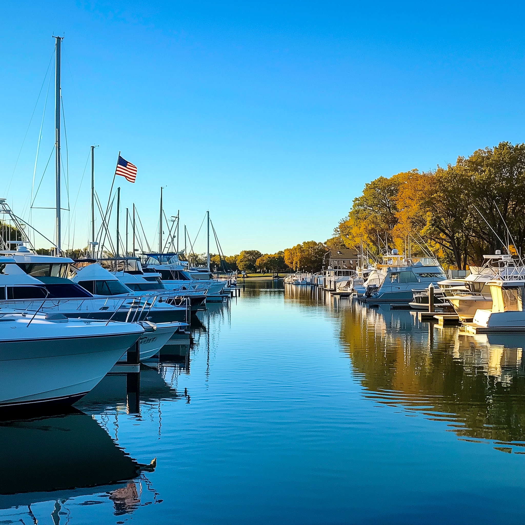
Transforming Long Beach Marina’s Website: A Case Study in Effective Web Design
Many small businesses today realize their website isn’t just a digital business card—it’s a dynamic platform that should captivate, inform, and convert visitors into loyal customers. The Long Beach Marina’s website makeover is a prime example of how a professional web development and design team can revitalize a digital presence, making it aesthetically pleasing, user-friendly, and strategically powerful.
In this detailed case study, we’ll explore the improvements made to Long Beach Marina’s website, highlighting the crucial changes in the visual hierarchy, typography, imagery, content organization, and overall user experience. This transformation underscores the importance of working with skilled professionals like the team at Unexpected Creative, who bring a wealth of expertise to every project and ensure your website isn’t just seen but remembered.
Visual Hierarchy and Layout: Creating Focus and Flow
Hero Section: From Cluttered to Captivating
- Before: The initial version of the Long Beach Marina website featured a hero section cluttered with text stretching across the entire page width, excessive text detracted from the background image, a key visual element that should have set the tone for the user experience.
- After: The redesigned hero section is a masterclass in visual hierarchy. The text has been centrally aligned and placed against a transparent background, allowing the stunning hero image to shine. This subtle yet powerful change enhances the site’s aesthetic appeal and makes the messaging clear and engaging. The result? A first impression that draws users in and keeps them interested.
Content Organization: Simplifying Navigation
- Before: The original website layout followed a single-column format, with large blocks of text and images stacked vertically. This design choice made the page feel endless and overwhelming, forcing users to scroll excessively to find relevant information.
- After: The new layout breaks the content into digestible sections, logically grouped with clear headings. This structured approach improves the user experience by making navigation intuitive and information easy to find. Visitors can now scan the page efficiently, finding what they need without feeling overwhelmed.
Navigation and Call to Action: Strategic Placement for Maximum Impact
- Before: Calls to action (CTAs) were scattered throughout the page, with minimal visibility and impact. Users were likely to miss these important prompts, reducing the site’s ability to convert visitors into leads or customers.
- After: The redesigned CTAs are now prominently and strategically placed. For example, the “Take a Visual Tour” button is highlighted in a contrasting color, drawing immediate attention. This change not only enhances user engagement but also guides them smoothly toward desired actions, improving conversion rates.
Typography and Readability: Enhancing User Comfort
Font Use: Modern and Readable
- Before: The original website used smaller, less modern fonts, which could make reading a chore—especially for users on mobile devices.
- After: The new design embraces larger, modern fonts with improved line spacing. This update significantly enhances readability across all devices, ensuring that users can easily consume the content without straining their eyes. In an age where mobile traffic is dominant, these adjustments are crucial for maintaining engagement.
Text Contrast: Making Every Word Count
- Before: Some sections of the website suffered from poor text contrast, with light text blending into the background. This made it difficult for users to read and absorb the information.
- After: The text contrast has been improved with a thoughtful approach to color choice—darker text on lighter backgrounds and vice versa. This not only improves readability but also ensures that the content is accessible to all users, including those with visual impairments.
Imagery and Aesthetics: Striking the Right Balance
Image Use: From Cluttered to Complementary
- Before: The original site was heavily reliant on images, but they were not always optimized or strategically placed. This led to a cluttered appearance that detracted from the overall user experience.
- After: The redesign strategically places images in a way that complements the text rather than overwhelming it. Each image is carefully selected and aligned to enhance the surrounding content, creating a visually pleasing and cohesive experience. This balanced approach to imagery helps in reinforcing the brand’s message without distracting the user.
Visual Appeal: Consistency Is Key
- Before: The website’s visual appeal was hindered by outdated design elements and inconsistent spacing, giving it a dated and unprofessional look.
- After: The new design introduces a polished and professional aesthetic, characterized by consistent colors, spacing, and high-quality images. This visual harmony not only improves brand perception but also builds trust with visitors, making them more likely to engage with the site’s content.
Information Density and Accessibility: Simplifying User Experience
Content Density: Less Is More
- Before: The original site was text-heavy, with large paragraphs that could easily overwhelm visitors. In today’s fast-paced digital world, users prefer content that is quick to read and easy to digest.
- After: The content has been streamlined into concise paragraphs and bullet points, making it easier for users to scan the page quickly. This reduction in content density not only improves readability but also keeps users engaged, as they can find the information they need without wading through unnecessary text.
Responsive Design: Adapting to Every Screen
- Before: While the old version of the website may have been responsive, it didn’t adapt well to different screen sizes, resulting in a subpar experience on mobile devices.
- After: The redesigned site is fully responsive, with elements that adjust seamlessly to various screen sizes. This ensures a consistent user experience across all devices, from desktop computers to smartphones, which is essential in today’s mobile-first world.
Footer and Additional Features: Enhancing Functionality
Footer Design: More Than Just an Afterthought
- Before: The footer was basic and lacked functionality, offering little value to the user.
- After: The new footer is much more informative and visually appealing, including essential contact information, a weather widget, and useful links. This enhancement not only adds functionality but also engages users even as they reach the bottom of the page.
Interactivity: Engaging Users Beyond Content
- Before: The original site had minimal interactivity, which limited user engagement.
- After: The redesign introduces interactive elements, such as the weather widget, that add value and keep users engaged. These features make the site more dynamic and enjoyable to explore, encouraging visitors to spend more time on the page.
The Unexpected Creative Difference: Why Professional Design Matters
The transformation of the Long Beach Marina website highlights the profound impact that professional web design can have on your business. By focusing on visual hierarchy, typography, imagery, and user experience, the team at Unexpected Creative turned a functional but outdated site into a modern, user-friendly platform that effectively communicates the brand’s message and engages visitors.
First impressions are everything, so partnering with a professional design team like Unexpected Creative can make all the difference. Whether you need a complete website overhaul or just a few strategic updates, our expertise ensures that your site isn’t just a reflection of your brand—it’s a powerful tool for growth.
Ready to elevate your online presence? Contact Unexpected Creative today and let’s make your website unforgettable. Our team of experts is ready to help you create a memorable website that connects with your audience. Let's work together to achieve your business goals. Contact Us Today!