Marketing Brochure
The Challenge
Part of the rebranding process for The Center • A Place of HOPE included an audit and overhaul of all marketing collateral. Consistent messaging and content that clearly defined the specialized treatment options, plans, positive outcomes, and call to action were the primary goals.
The Solution
It was discovered during the marketing collateral audit, that patients felt stressed with the overwhelming amount of content provided to them in the 4-fold paneled brochure. This new approach streamlined the design to a handout with clear content message points that give a “snapshot” of the treatment outcomes along with the capabilities of The Center • A Place of HOPE.
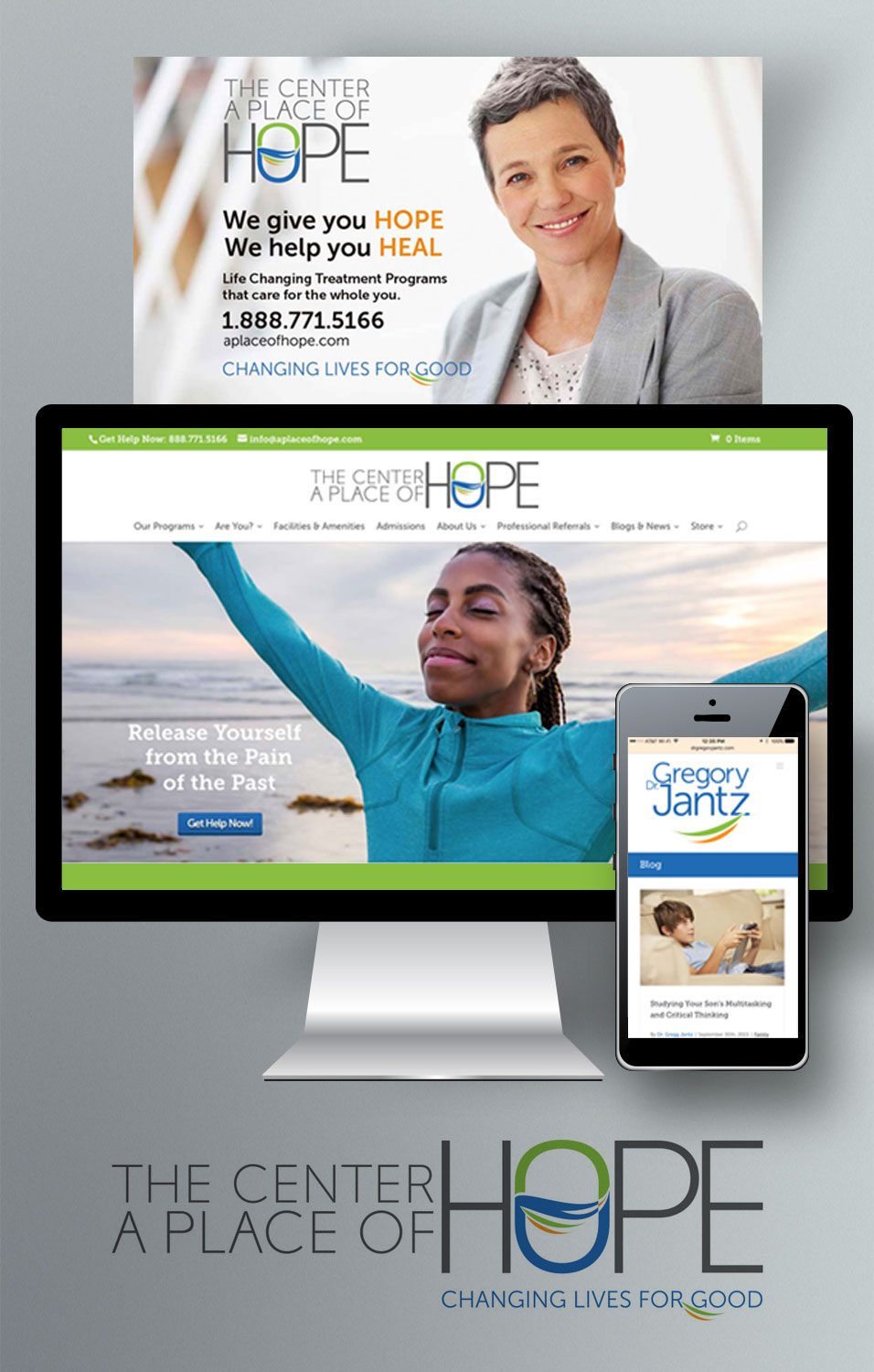
The Center • A Place of HOPE and Dr. Gregory Jantz
Brand Relationships
The Challenge
We found a disjointed brand full of inconsistencies. Even worse the brand for The Center • A Place of HOPE was not related at all to Dr. Jantz’s personal brand. We needed to create two logo identities that could support each other and interconnect.
The Solution
The logo treatments share the same color palette and have common illustrative features. They have a connection with each other while supporting separate entities.
Logo Treatments
The Challenge
Who is Dr. Gregory Jantz?
Sure, easily defined as an author, speaker, and founder of The Center • A Place of HOPE. But what is the essence of his personal brand and how does it relate to the brand of The Center?
Here is what we found:
He creates hope. He creates possibility. He is the visionary that makes all of the outcomes possible.
The Solution
This logo treatment leads graphically with Dr. Jantz’s name.
Leading graphically and consistently with the name helps to position Dr. Jantz outside of The Center • A Place of HOPE and further support his personal business goals.
The graphic treatment of this logo mark is different from that of The Center • A Place of Hope; however, it shares the same color palette and illustrative movement that connects the two.
The Center • A Place of Hope
The Challenge
Part of the re-branding process for The Center • A Place of HOPE was the development of a new logo, identity, and color palette system. The previous logo had been created in the late 80’s and there was no affinity or emotional tie to the brand. Once we completed the branding research, we began the task of translating the brand promise for The Center visually.
At the beginning of the design process, we asked ourselves a question:
What does HOPE look like? What does it feel like?
HOPE is the promising, optimistic force that provides options to those who feel they have nowhere else to turn. It is Whole. It is Calm. It helps people SOAR and transform their lives.
The Solution
This logo treatment leads graphically with the brand promise first, instead of the words, The Center.
Leading with the promise is a bold testament to living the brand. It reinforces the outcome of the experience at The Center, placing it in the forefront of the mark. Its coordinating tagline, Changing Lives for Good reinforces the mission and vision of The Center
The illustrative graphic treatment within the “O” reinforces the transformative experience that happens within the walls of The Center. It is whole. It has energy. It is calm. It is SOARING. And most importantly, it reinforces the unique, collaborative experience between the counselors/staff and the patients.